If you’ve read the post About us, then you’ll know Mike’s background is in graphic design. So here’s the story of how our branding came about…
Designing a brand for a client? Easy, my bread and butter. Designing one for my own business? Hard, really hard. I put myself under a lot of pressure to produce something incredible, and found it very difficult to stand back and analyse, like I would when creating any other brand.
But I got there in the end and am well pleased with the solution, I’ll try not to get too technical or “wanky” but here’s the creative journey…
Inspiration
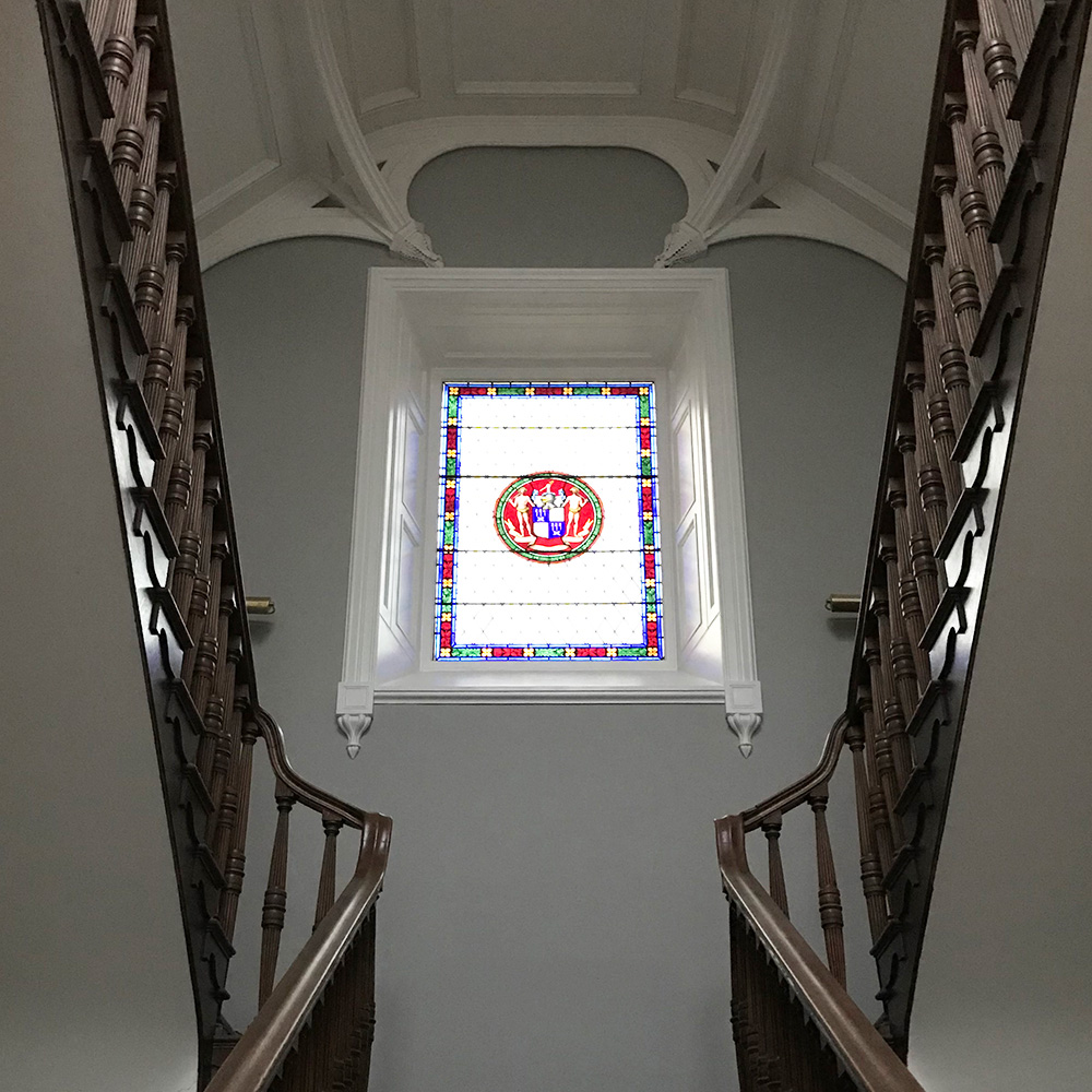
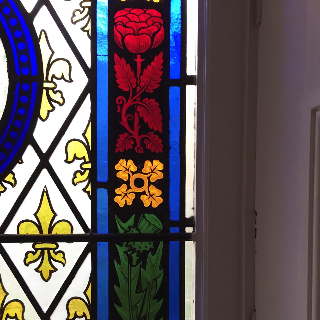
Endless amounts! Netherbyres is just an inspiring place, from the stained-glass windows, the decorative vaulted buttresses (I doubt they’re called this but I’m no Kevin McCloud), the scale of the Grand Hall and marble fireplaces to the incredible grounds with Roe Deer and flapping pheasants. Netherbyres has had a long association with gardening and that became the core theme.
But rather than matching the original features with traditional branding, we wanted to create a real juxtaposition with bold and modern branding and interiors.
Crafting
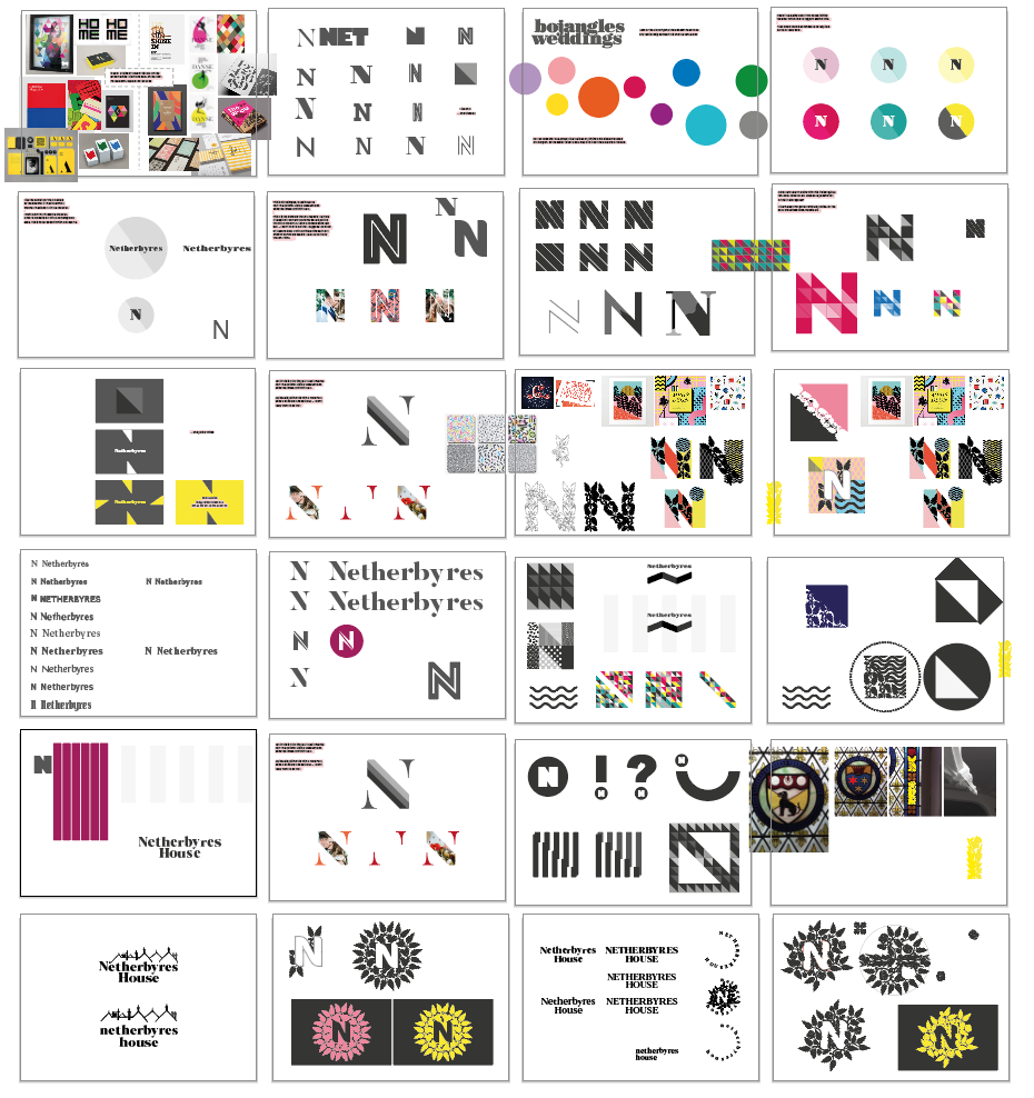
Hours and hours spent drawing foliage in Illustrator (thanks goes to my friend Adam Mitchinson for teaching me how to use Illustrator in 2003). I wanted a wordmark and logotype that could work together but also independently, it’s all about flexibility! Getting the balance right between the elements proved difficult but many more hours of, for want of a better word – faffing – soon worked.
Application
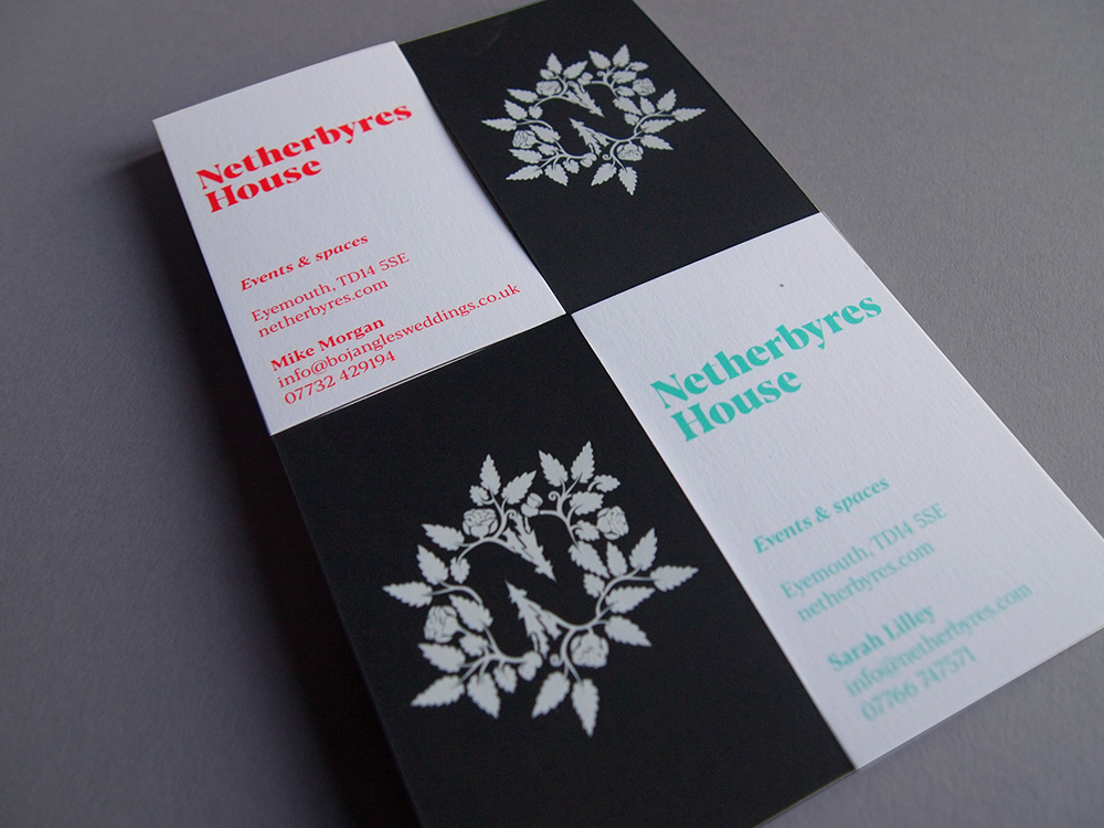
Print-wise we used GF Smith’s Plike, I’ve always loved the very tactile almost velvety stock which seemed perfect for a wedding venue. Anyway, I only ever use GF Smith which is mostly down to the legend and always charming Paul Scharf. The white stock is as pure as Mrs Bojangles chest fur (that’s our cat for those of you who aren’t familiar) and contrasts perfectively with the graphite, providing an ideal backdrop to some vivid “in your face” colours. For our business cards we went with bright coral for me and minty green for Sarah – always keen to challenge gender stereotypes!
The website is ongoing! We’re just finishing off a couple more rooms before getting the pro photographers in to shoot the place. Bare with us! Design-wise it’s the same contrast between graphite and blasts of colour. The copy was v important to us – we wanted to get across our personality and sound approachable, rather than sounding like something out of a Jane Austen novel, which seems to often be the case in the wedding industry.
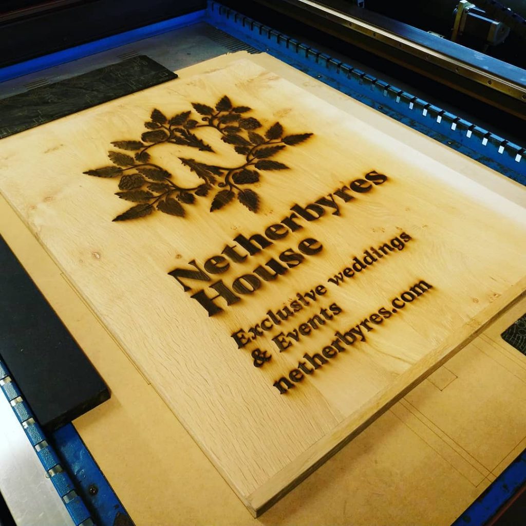
The latest addition is a new sign. Jane from Laser Flair (along with a few friends) created this amazing oak sign for the entrance. My apologies for not having installed it yet, photos to follow once I’ve got around to that job.
I’ve got to go, there are bar menus that need designing.